First, Some Facts
- Colors alone can influence up to 90% of an initial impression.
- Color influences 85% of shoppers’ purchase decisions.
- Colors increase brand awareness by 80%.
- 93% of shoppers focus on visual appearance alone when they consider a purchase.
Source: review42.com
We all know that first impressions matter but sometimes we underestimate just how much.
In business, a lot of first impressions happen online, before a potential customer even has the chance to meet you. This means that how you come across online is important.
This includes ensuring everything from the logo, to the website, to the Facebook banner to the selfie you put on your LinkedIn page is portraying a true representation of you and your business.
Your brand, and how it is portrayed starts with your values and your services, this is the core of the brand. This is then represented to the world through your branding – the colours, logos, banners etc.
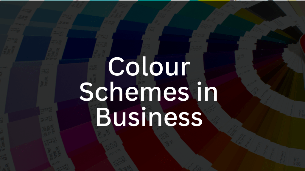
Today, we will discuss the importance of colour schemes:
🔍 Did you know that colors evoke emotions and play a crucial role in shaping perceptions? They go beyond aesthetics and influence how your audience perceives your brand.
Brand Memorability:
Did you ever play that logo game where only part of the logo was given, or perhaps the colours and you still instantly knew which company it belonged to? Having a strong brand identity which remains consistent can help make your business more memorable. This shows up with consistent use of colours across your logo, banners, marketing material, website, social media and so on.
Industry connection:
Some colours lend themselves more towards certain industries. For example, you wouldn’t expect a Kid’s Candy Floss Factory to have their dominate colour as black. Competitor and market research here can help you identify which colours your industry prefers.
Emotional Connection:
Different colors trigger different emotions. Understanding the psychology behind colors helps you connect with your audience on a deeper level. Check out this blog from Hubspot who go more into detail on colour psychology.
Readability and Accessibility:
Picking the right combinations of colours improves readability and accessibility. High-contrast color combinations enhance visibility, making your content more user-friendly, especially for individuals with visual impairments. Google actually favours websites with better accessibility so get this right in the first instance with a good colour scheme.
Competition:
A well-thought-out color scheme which is memorable and aligns with your values and the industry can help you stand out amongst the competitors who haven’t given it as much thought.
Remember, there’s no one-size-fits-all approach to color schemes. It’s about aligning colors with your brand personality, target audience, and industry. If you need a hand putting together your colour schemes and brand guidelines, drop us an email on hello@hypedhealthmarketing.com.

